WEB
UI/UX
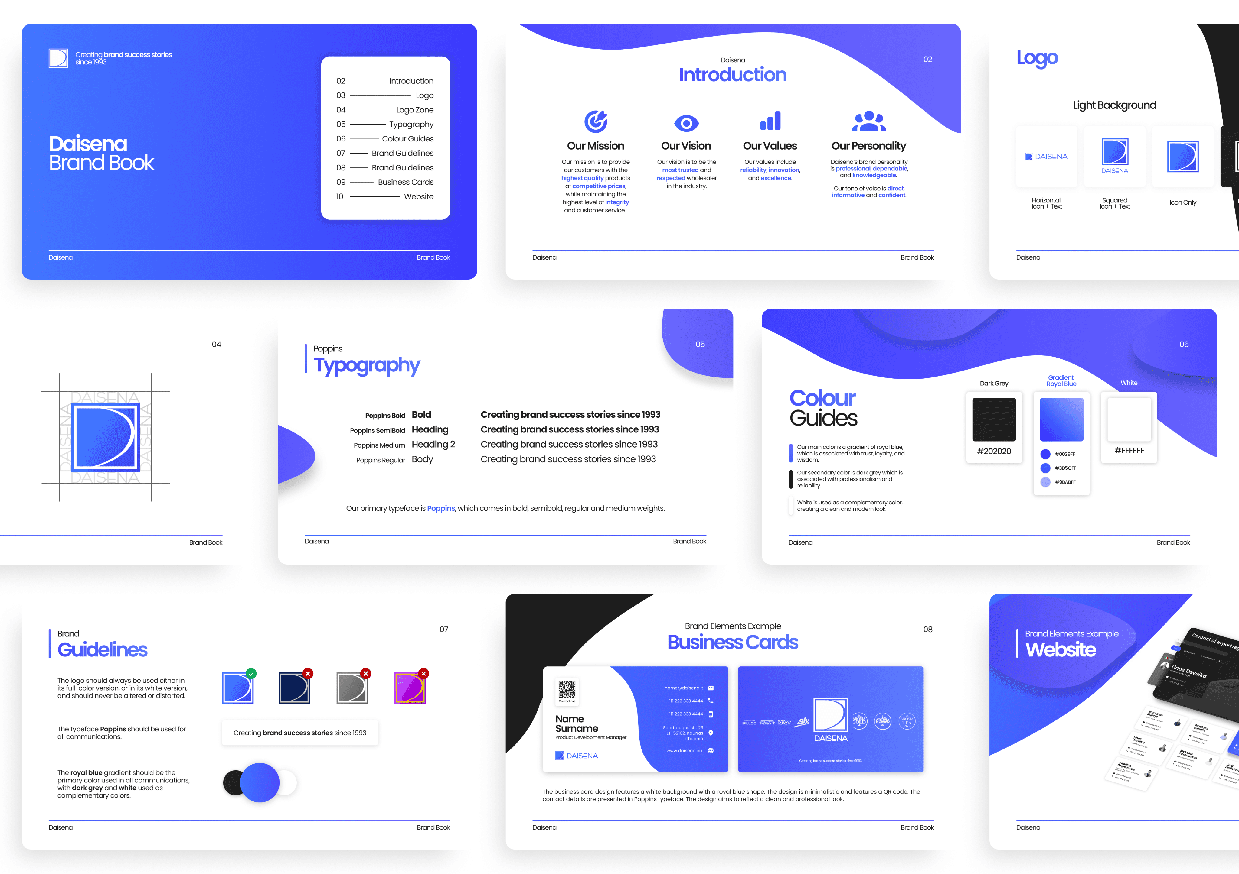
BRANDING
UI/UX, web development and rebranding for a wholesaler company

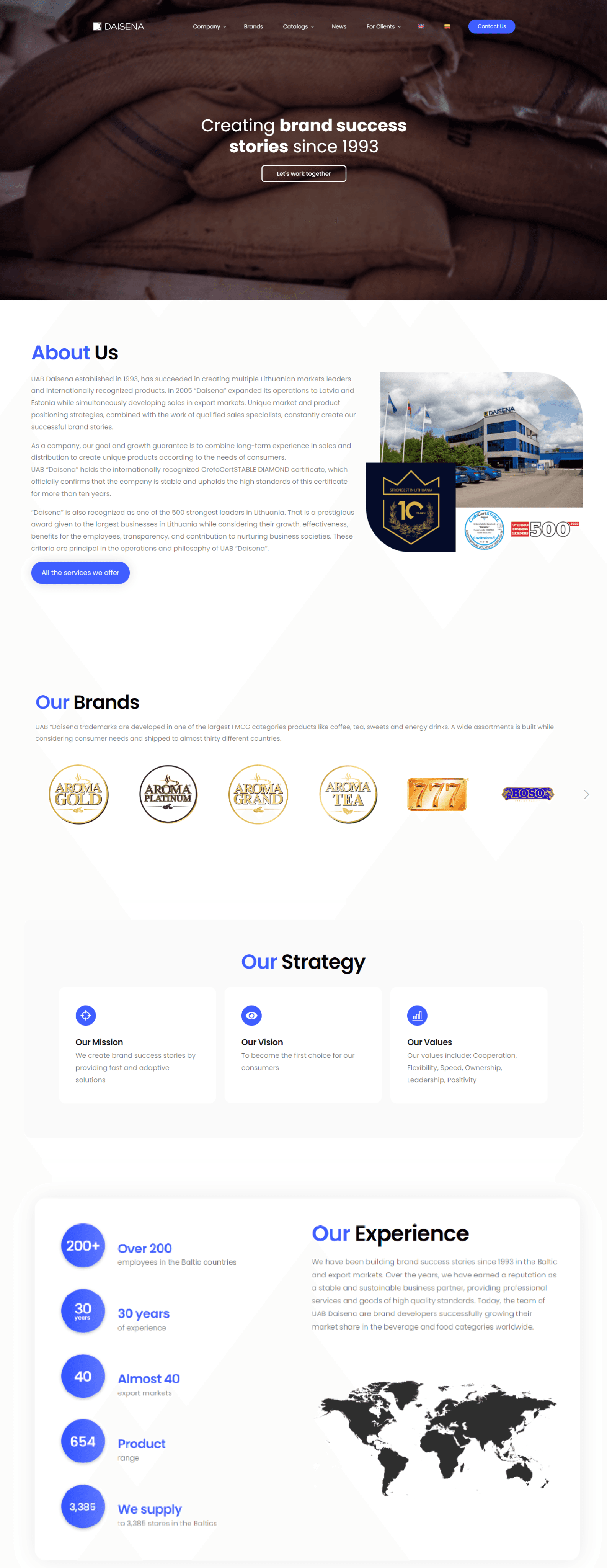

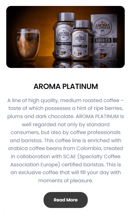


In my recent role, I spearheaded a comprehensive rebranding initiative for Daisena, a wholesaler company specializing in services. Central to this effort was the development of a modern and visually striking website, aligning with the redefined brand identity. The website's design embraced a clean and minimalistic approach, featuring a sophisticated color palette of white, royal blue, and greyish black. The primary goal was to seamlessly integrate the rebrand into an intuitive and user-friendly online platform, effectively showcasing Daisena's evolved services and cultivating a professional and compelling brand image.
My approach to the rebranding and web development for Daisena was characterized by a strategic fusion of functionality and aesthetics. Through in-depth research and a user-centric design strategy, I ensured that the website not only reflected the revitalized brand ethos but also prioritized an intuitive user interface. The clean and minimal design, adorned with elegant royal blue and greyish black elements, aimed to elevate the presentation of the company's redefined offerings.
© 2024 Dawood
Liverpool